The Staffordshire Kitchen
7th September 2015
We’re so used to seeing beautiful images of our stone. We’re a bit spoilt really. Every now and again though, we get some images through which make us stop and do a double take. Sometimes because they’re so beautiful or sometimes because there’s something a bit unexpected about them.
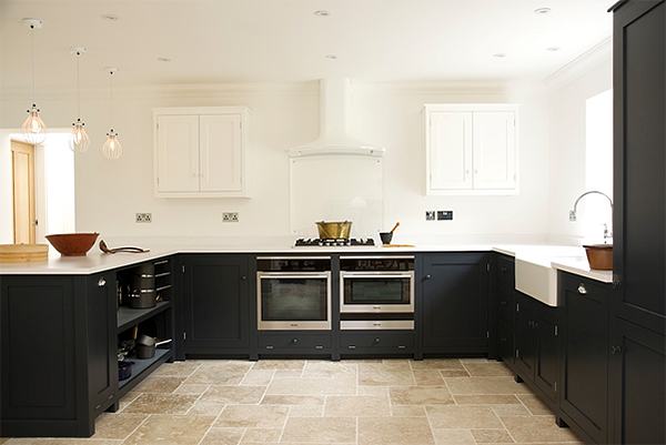
This gorgeous kitchen is one such image that made us stop and stare. A deVOL Kitchens and Floors of Stone combination working at its very best.
The customer chose to have a clean, contemporary feel to the kitchen, making the most of the light and space available in the room. Instead of following this modern finish through to the floor, they decided to mix it up with more rustic, textured tiles. An unusual twist, but one that works well considering the house is set in the Peak District.
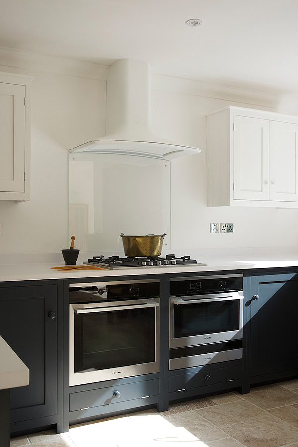
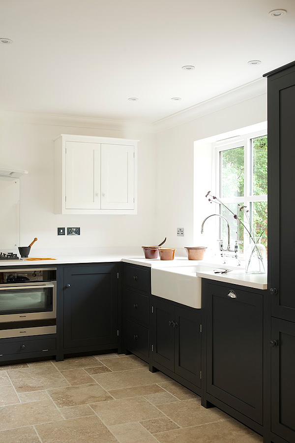
The kitchen is from our sister company deVOL’s Shaker range. The base cabinets are painted in ‘Pantry Blue’ a really dark, inky blue, which the room can take it due to the light streaming in through the window and the light colours used elsewhere. The wall cupboards have been cleverly painted the same white as the walls, so they blend in seamlessly, helping to make the space appear bigger and less cluttered. The white Silestone worktops, modern extractor fan from Elica and stainless steel appliances all combine to create a modern, clean finish to the room.
Light Tumbled Travertine tiles in the opus pattern were used on the floor to bring a more rustic vibe to the kitchen. The tiles have tumbled edges and have been left unfilled to create the feeling of a floor that has been down for decades. Perfect for busy family kitchens, especially in older properties. Ivory, oatmeal, light tan and creamy tones blend together creating a beautiful feature floor. Natural stone has such a genuine, interesting quality to it that even the very best porcelain tiles cannot recreate the unique variation and textures of the tiles. The light tones of the travertine act as a good contrast to the dark blue cabinets, and help to keep the space feeling fresh and light.
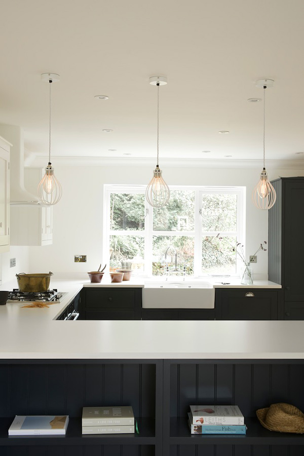
I love the personality of this kitchen, including the fun pendant lights which look like giant balloon whisks! Such a perfect blend of contemporary and traditional features. Proof that the two can be mixed successfully.
