Website Additions
9th June 2014
Here at Floors of Stone, customers are our priority. We always take comments of how we can improve our service on board, and where possible, implement changes.
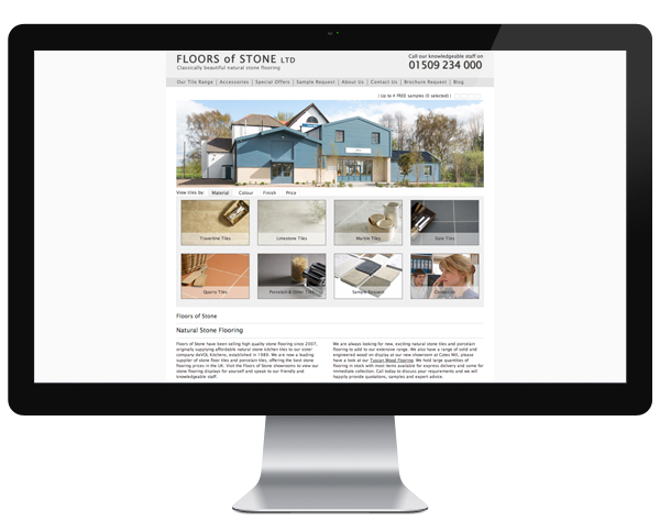
We get a lot of comments about how great our website looks, but some customers felt it was lacking a bit of information. Over the past few weeks we’ve been working hard, to bring about some changes and add useful material.
We’ve added a new, deeper footer with more links, to make it easier to navigate our site. It also contains links to our social media pages, where you can find more pictures, information and inspiration. We went through a few designs, but finally settled on the four columns, which we think looks neat and easy to use.
We’ve also added some new pages to the website, including a glossary of terms, frequently asked questions and delivery information. We’ve introduced these as if you’re new to the world of natural stone, then the terms and conflicting advice can be confusing. This way customers can read and digest the information at their leisure. You are of course still free to call and speak to a member of our knowledgeable sales team or email enquiries, if you would like any clarification.
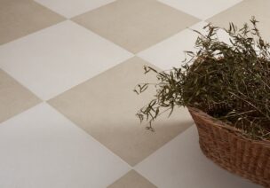
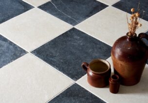
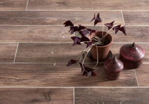
Underneath each product, we have also added some further information about the type of stone and where you are able to use it. We have also added some images and links to related products, to offer ideas and inspiration of tiles you may not have even considered.
We’re hoping this will make our site even easier for customers to use and offer some much needed information. Let us know what you think!


